Feng shui tradition asks wall art to be calm, welcoming and suited to the room's purpose: gentler scenes where people rest, clearer and steadier images where they work. Practitioners disagree on water, mountains and people. The practical craft is simpler: center the art around 57 inches high, size it to the furniture below, and fix it securely.
Last checked: 13 November 2026
| Key fact | Figure or rule | Source |
|---|---|---|
| Standard hanging height | 57 inches from the floor to the center of the artwork | The Arts Commission, hanging artwork slides |
| Gap between works in a grouping | About 2 to 6 inches, small and consistent | The Arts Commission, hanging artwork slides |
| Light for sensitive works on paper | 50 lux or as low as possible; up to 150 lux for stable carbon ink on good paper | Canadian Conservation Institute, Notes 11/2 |
| Ultraviolet limit | Should not exceed 75 microwatts per lumen | Canadian Conservation Institute, Notes 10/4 and 11/2 |
| Heavy objects over beds and seats | Avoid; secure frames with closed hooks or earthquake putty; two hooks for large pieces | Federal Alliance for Safe Homes (FLASH) |
| Mat board for paper | 100 percent rag board, white or ivory, acid-free | Canadian Conservation Institute, Notes 11/2 |
Most feng shui art advice stops at subject: hang this, avoid that. A wall is also a physical object. The art has a size, a weight, a height from the floor, a light level and a way of being fixed. This guide does both halves. First what the tradition says room by room, with attribution and with the places where teachers do not agree. Then the measuring, spacing, lighting and safety work that decides whether the art looks right and stays on the wall.
It does not cover mirrors beyond a single sentence. A mirror is both an object and a symbol, with its own rules, so it has its own page: the mirror placement guide.
What feng shui tradition says about art, and who says it
Feng shui is not one rulebook. Three strands matter for wall art.
Form school reads what stands behind, in front of and beside a building or seat. For art it shows up as the old image of a supported seat: something solid behind a chair or bed, open space in front. Practitioners translate that into steadier images behind where you sit and calmer, more open ones in front.
Compass school and Eight Mansions tie rooms and directions to the five elements, so art becomes a way to bring an element's color, shape or subject into a sector. Our five elements balancing guide shows how the cycle works.
Black Sect (BTB) and Western popularizations map the Bagua over the floor plan from the front door and match art to each square's theme. Schools lay that map out differently: the International Feng Shui Guild notes that some divide the nine squares equally and that most perspectives use the Bagua in slightly different formats (International Feng Shui Guild, checked November 2026).
LoveToKnow's guide to feng shui paintings summarizes the popular rules: water scenes belong to the water element, mountain scenes to earth, scenes of disaster, war, storms, unhappiness or loneliness are said to carry negative energy, and sharp angles are best softened with curves (LoveToKnow, checked November 2026). These are what practitioners and popular writers say, not facts about what a picture does. The tradition is a cultural and design practice and promises no money, health, love or quicker sale.
Two habits hold across schools. Art should be something the household likes to look at, and it should be in proportion to the wall, because an oversized or tiny piece reads as unbalanced long before any energy argument starts.
Room by room: subject, height and size
The table below joins what tradition favors and avoids with practical numbers. The size and height columns are our planning ranges built on the 57 inch center-line standard and the 60 to 75 percent width range explained later, not rules from the tradition.
| Room and wall | Tradition tends to favor | Tradition tends to avoid | Practical size and height |
|---|---|---|---|
| Entry, facing the door | One calm, welcoming image; an open landscape or still life | Crowded collages, harsh or threatening subjects, sharp-angled abstracts | 60 to 75 percent of the console or wall section below; center near 57 inches; keep the path clear |
| Living room, behind the sofa | Balanced, steady scenes; grounded landscapes; family-friendly subjects | Sad, violent or chaotic imagery; art so heavy it feels like it looms | 60 to 75 percent of sofa width; bottom edge 6 to 10 inches above the back |
| Dining room | Abundance themes: fruit, harvest, shared tables, gentle water | Scenes of conflict, empty or desolate images | Art or group centered on the table or sideboard; center near 57 inches |
| Bedroom, above the bed | Calm, light, soft subjects; or nothing | Heavy frames, aggressive or stormy imagery, strong sharp angles | 60 to 75 percent of the headboard; light frame and glazing; secure fixings |
| Bedroom, side walls | Images of rest, nature, shared or paired imagery in couples' rooms | Images of loneliness or distress | Center near 57 inches; keep away from the pillow zone |
| Home office, behind the desk | Steady, solid, supportive images such as a mountain; muted palette | Water or open scenes that read as "nothing behind you"; busy art | Art sits above the monitor line; do not hang it so it blocks window light |
| Home office, in front of the desk | Inspiring but quiet; a view that opens space | Distracting, strongly saturated or disturbing pieces | Center at seated eye level, a few inches below 57 inches if you view it mostly seated |
| Stairs and halls | Rising or open scenes on the stair; a gallery rhythm in a hall | Overhead heavy frames above steps; clutter that narrows the path | Center each piece near 57 inches; keep frames shallow in narrow halls |
| Bathroom | Few pieces; botanical or mineral images; things that tolerate damp | Too much water imagery on a wet wall; unsealed paper art | Moisture-resistant frame and glazing; keep paper art out of steamy rooms |
A few of these deserve more than a table cell, because teachers split on them.
Entry: the first image people meet
Tradition cares about the first impression, so practitioners ask for a welcoming, uncluttered image rather than a confronting one. Stand where a guest would stand when the door opens: a sharp-edged piece, a crowded group or a gloomy scene will feel heavy. Entries are also narrow, so choose shallow frames and keep the path clear. Our small condo entryway guide covers the arrival sequence of door, shoes, light and wall.
Living room: behind the sofa
Form-school thinking prefers a solid support behind a main seat, so a steady image suits this wall: a landscape with a stable horizon, a still life, a large abstract in the room's palette.
Teachers disagree in two places. Some like a mountain scene behind a seat because it echoes the supported-seat idea; others warn that a very large, dark mountain looming over your head feels heavy. Scale settles it: a moderate frame, balanced by other colors, reads as support. On water, some popular writing links it to flow and prosperity while others find a stormy sea or rushing waterfall agitated in a seating area. A calm lake or slow river is easier to live with. The living room layout guide is the hub for the whole room, and the sofa placement guide settles where the sofa sits before you decide what goes above it.
Dining room
Tradition links the dining room to nourishment and sharing, so fruit, a laid table or a gentle landscape suit it. Keep art out of reach of splashes and cooking steam, and center it on the table or sideboard.
Bedroom: what to hang above the bed
This is the question with the most real-world stakes, so it gets the most care. Feng shui teachers who write about bedrooms generally ask for calm, soft, restful imagery and discourage anything aggressive, sad or stormy. LoveToKnow's summary of paintings adds a point on water: because water is said to suppress fire in the element cycle, water scenes in a bedroom could "cool passions," so the cautious view is to keep them elsewhere (LoveToKnow, checked November 2026). Other writers take the opposite view and like blue, quiet water for sleep. That is a real disagreement, not a settled rule.
Two disagreements are worth naming. On solitary figures, some practitioners prefer paired or grouped imagery in a couple's bedroom and avoid a lone figure as isolating; others call it taste. On family photos, some like a few, while others keep the bedroom to calming images and put photos in a hall. Neither side has evidence beyond tradition, so a single person who likes a solitary-figure print is not breaking a rule all schools share.
The safety side is not a matter of opinion. The Federal Alliance for Safe Homes (FLASH) advises avoiding heavy objects above beds, sofas or any place you may be seated, securing pictures and mirrors with closed hooks or earthquake putty, hanging large pieces on two hooks rather than one, and using eye-hooks long enough to go through the wall into the studs, at least 1 to 2 inches long (FLASH, checked November 2026). That overlaps with the traditional preference for lightness over the bed. A lightweight print behind acrylic, on two secure fixings, satisfies both. If you cannot confirm the fixing, move the art to a side wall.
Nurseries are covered under fixings below. For layouts that involve the bed itself, see the bedroom layout for couples guide.
Home office: behind and in front of the desk
For the desk, tradition returns to the supported-seat idea. Behind you, practitioners like something steady and solid, such as a mountain image or a plain wall, rather than an open window or a busy scene. In front of you, the preference is for something quiet that gives the eye room to rest, not something that demands attention. The arrangement of the desk comes first; our home office desk placement guide sets out the command position and what to do when it is not possible.
Practically, you view the wall in front of a desk seated, so lower the center a few inches from 57 inches. Watch glare: a glazed frame facing a window reflects it all day.
Stairs, halls and bathrooms
On a stair, keep frames shallow and never hang a heavy frame overhead where a fall would land on someone. In a bathroom, steam ruins paper art: use sealed prints or tile and keep originals in a drier room.
Advertisement
The craft: height, width and gap
Center height
The standard used by galleries and arts organizations is to hang art so the center is 57 inches from the floor. A guide from The Arts Commission gives the same figure and explains how to find the nail height: halve the artwork's height, subtract the distance from the top of the frame to the hanging point, and add the result to 57 inches. Their example is a 30 inch piece with hardware 5 inches below the top, which puts the nail at 67 inches (The Arts Commission, hanging artwork slides, checked November 2026).
Check the arithmetic with your own piece: 57 + (30 / 2) - 5 = 57 + 15 - 5 = 67 inches.
Measure to the middle of the piece, not to the top edge. If you measure to the top of every frame, tall pieces end up too high and short ones too low, which is the most common error in a home hall.
Width against the furniture
Art that hangs over furniture should relate to it. There is no standard in the sources we opened, so the range below is our own planning range, drawn from common design practice and stated so you can adjust it: art or a group about 60 to 75 percent of the width of the sofa, console or headboard below it.
| Furniture width | 60 percent | 75 percent | Reasonable art width |
|---|---|---|---|
| Console, 36 inches | 21.6 inches | 27 inches | 22 to 27 inches |
| Queen headboard, 60 inches | 36 inches | 45 inches | 36 to 45 inches |
| Sofa, 72 inches | 43.2 inches | 54 inches | 43 to 54 inches |
| Sofa, 84 inches | 50.4 inches | 63 inches | 50 to 63 inches |
| Sofa, 96 inches | 57.6 inches | 72 inches | 58 to 72 inches |
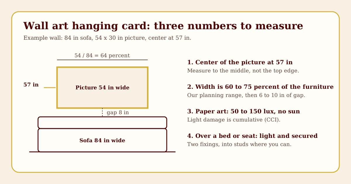
To use the table, multiply the furniture width by 0.6 and by 0.75. For an 84 inch sofa: 84 x 0.6 = 50.4 and 84 x 0.75 = 63. A single piece 54 inches wide is 54 / 84 = 0.64, or 64 percent, which sits inside the range.
The gap above the furniture
Leave enough gap that the art and the furniture read as separate objects tied together, not one stacked mass and not two unrelated things. We use about 6 to 10 inches above a sofa back or headboard as a planning range. It is our working range, not a standard. If the gap pushes the center well above 57 inches, you may accept a higher center, since the furniture is the anchor on that wall.
Spacing in a gallery wall
For a group, The Arts Commission advises keeping gaps between works small and consistent, about 2 to 6 inches (The Arts Commission, checked November 2026). Pick one gap and keep it. Treat the group as one shape and center the whole arrangement around 57 inches, not each piece.
Worked example: six frames, each 12 inches wide and 16 inches tall, in two rows of three with a 3 inch gap.
- Width: 3 x 12 + 2 x 3 = 36 + 6 = 42 inches.
- Height: 2 x 16 + 3 = 35 inches.
- Center the block at 57 inches: the bottom edge is 57 - 17.5 = 39.5 inches and the top is 74.5 inches.
If that block hangs over a 60 inch console, its width is 42 / 60 = 70 percent, inside the range.
Three worked walls
Wall 1: living room above an 84 inch sofa
Inputs: sofa 84 inches wide, back 34 inches high, one picture 54 inches wide by 30 inches tall, hanging wire 4 inches below the top of the frame.
- Width: 54 / 84 = 64 percent, inside 60 to 75 percent.
- Bottom edge if the center is at 57 inches: 57 - 15 = 42 inches. The gap above the sofa back is 42 - 34 = 8 inches, inside 6 to 10 inches.
- Nail height: 57 + 15 - 4 = 68 inches.
- Horizontal: center the picture on the sofa, 15 inches in from each end of the 84 inch sofa (84 - 54 = 30; 30 / 2 = 15).
The wall works because the center-line standard and the furniture gap agree. Where they disagree, the furniture wins.
Wall 2: bedroom above a queen bed
Inputs: headboard 60 inches wide and 48 inches high, a lightweight acrylic-glazed print 42 inches wide by 24 inches tall, hanging point 3 inches below the top, studs located behind the center.
- Width: 42 / 60 = 70 percent.
- Bottom edge for an 8 inch gap: 48 + 8 = 56 inches, so the center is 56 + 12 = 68 inches, 11 inches above the 57 inch standard. That is expected: a headboard pushes the art up.
- Nail height: 68 + 12 - 3 = 77 inches. Hang on two hooks, with at least a 1 to 2 inch screw length into the studs, as FLASH advises.
- Check the weight: keep it light. If the finished frame is heavy or you cannot reach a stud, move the art to a side wall.
The art sits above the head, where tradition prefers lightness and safety guidance calls for caution. If the choice is a large heavy piece or nothing, nothing is better.
Wall 3: entry wall facing the door
Inputs: a 36 inch console with its top at 32 inches, one picture 24 inches wide by 30 inches tall, hanging point 3 inches below the top.
- Width: 24 / 36 = 67 percent.
- Bottom edge at center 57: 57 - 15 = 42 inches, so the gap above the console is 42 - 32 = 10 inches, the top of the range, which leaves room for a lamp or bowl.
- Nail height: 57 + 15 - 3 = 69 inches.
- Tradition asks for something welcoming here, such as a calm landscape or a still life.
Frames, mats and the five elements
If you work with the element cycle, practitioners usually read frame materials this way: wood for wood, metal for metal, glass and dark colors for water, warm ceramic or stone-like finishes for earth, red or triangular shapes for fire. Treat this as design vocabulary, not a measure of effect. The colors by room guide shows how those colors are usually assigned to rooms.
Practical frame points that matter more than the element:
- Weight and depth. Heavier frames need stronger fixings and are the ones to avoid over beds and seats. Deep frames catch elbows in halls.
- Mat board. For works on paper, the Canadian Conservation Institute recommends 100 percent rag board, buffered to pH 7.5 to 8.5 or unbuffered at pH 7, in white or ivory, with acid-free materials throughout. Highly purified wood pulp board buffered to pH 8.5 is an acceptable second choice (Canadian Conservation Institute, Notes 11/2, checked November 2026). A cheap acidic mat can stain a print over time.
- Glazing. The CCI recommends glazing for all artworks, including works on paper, canvas and rigid supports (CCI Notes 10/4, checked November 2026). Acrylic is lighter than glass, which also helps with safety over a bed, and UV-filtering versions of both are sold.
Advertisement
Light and the life of a print
Light damage is the quiet failure. The Canadian Conservation Institute says the effect of light is cumulative and irreversible, and that damage is proportional to light intensity multiplied by exposure time. Its example is that 200 lux for 200 hours equals 100 lux for 400 hours or 50 lux for 800 hours, which is 40,000 lux-hours in each case (CCI Notes 10/4, checked November 2026).
For works on paper, the CCI recommends keeping light to 50 lux or as low as possible for sensitive materials such as watercolors, colored prints and works on poor-quality paper, and a maximum of 150 lux for works without light-sensitive materials, such as stable carbon inks on good-quality paper. Ultraviolet should not exceed 75 microwatts per lumen (CCI Notes 11/2, checked November 2026).
For perspective, the CCI note on paintings gives typical office light as about 500 lux and daylight as about 30,000 lux. At those levels, highly sensitive paints can show noticeable fading within months to two years in office light and within a day to two weeks in full daylight (CCI Notes 10/4). That note is about paintings, but it shows how far a sunny wall sits from the 50 to 150 lux range for paper.
What this means in a home:
- Keep valued prints, photographs and watercolors off walls the sun reaches. A wall opposite a south or west window is the usual problem.
- Glaze the frame and keep distance from the window. UV-absorbing window film reduces UV damage but does not mitigate fading caused by visible light, so it does not replace distance from the sun (CCI Notes 10/4).
- Choose LED over unfiltered fluorescent for picture lights. The CCI reports white LEDs emit 0 to 75 microwatts per lumen, while fluorescent tubes emit 75 to 150 and need filters.
- Rotate or rest. If a piece must hang in a bright room, swap it with another and store the resting one dark and dry.
Fixing the art to the wall
The FLASH fact sheet on hanging items is written for earthquake safety, but its rules are good practice in any home: secure frames and mirrors with closed hooks or earthquake putty, use two hooks for large pieces, make sure eye-hooks go through the wall into the studs, use hooks at least 1 to 2 inches long, and confirm the wire and hardware on the back of the frame are firmly attached (FLASH, checked November 2026).
The Arts Commission adds: find studs when you can, always match the hardware to the weight and shape of the piece, and do not hang a piece from the edge of its frame. It lists drywall anchors among the hardware options and calls removable adhesive hooks a good option only when you cannot put holes in the wall (The Arts Commission, checked November 2026).
The sources we opened do not give weight ratings for anchors or hooks, so rely on the rating printed on the package, which its maker sets. Then match the fixing to the wall: screw into a stud for heavier frames (locate it with a finder and confirm with a small test hole), use a drywall anchor rated above the frame weight where there is no stud, drill gently in old plaster after testing a hidden spot, and use a masonry anchor and the right bit in concrete. In a rental, check the lease and keep removable strips for light pieces within the strip's printed limit.
Weigh the frame on a bathroom scale before buying hardware: a 54 by 30 inch frame with glass can weigh more than most people guess.
Heavy frames over beds, seats and cribs
Put the rules together. Do not hang a heavy frame or mirror over a bed, sofa or any place you sit, as FLASH advises. If you do hang something there, make it light, glaze it with acrylic, and use two secure fixings into studs.
Cribs need their own line. The US Consumer Product Safety Commission's safe-sleep guidance is about what goes inside the crib: keep it bare. It does not mention wall art, and neither do the other sources we opened. As our own caution, not a CPSC rule, hang nothing over a crib and fix any frame near it as if a child could pull it down.
Children climb. The CPSC's Anchor It campaign warns that unsecured TVs, furniture and appliances are hazards in every room and asks families to anchor them (CPSC Anchor It, checked November 2026). A console or dresser under a picture is furniture too: if you have young children, anchor it to the wall before you worry about the art above it.
What to check before you buy art online
A screen shows color and proportion badly. Before you pay, check these:
- True size. Look for the overall frame size, not just the image size. A listing for a "24 by 36" print may be the paper size, and the frame and mat add several inches. Mark the real overall size on the wall with painter's tape.
- Orientation. Portrait or landscape: confirm which, and whether the piece can hang either way. A tall narrow piece above a wide sofa fails the width test.
- Frame depth and weight. Ask for the depth and the shipping weight. Depth matters in halls and over narrow consoles; weight matters for the fixing.
- Glazing type. Glass, acrylic or none. Acrylic is lighter; UV-screening is better for anything on paper.
- Mat and backing materials. For works on paper, look for acid-free or rag materials, as the CCI recommends. A listing that says nothing may mean ordinary board.
- Hanging hardware. Does it come with wire, D-rings or a cleat? Is the hardware rated for the weight?
- Return policy. Large framed pieces are costly to return and may arrive damaged. Check who pays return shipping and whether you must keep the original packaging.
- Color in your light. Order a sample or a small print if the color matters, and look at it in the room at the hour you use it.
Common mistakes and edge cases
- Hanging too high. The most common error is placing the art so high that it floats away from the furniture. Use the center-line and gap arithmetic above.
- Too small for the wall. A single 12 inch frame behind an 84 inch sofa looks lost: size up to 50 to 63 inches or group several.
- Rentals. Check the lease. Use removable strips for light pieces, lean larger art on a shelf, and never drill into a wall you are not allowed to drill.
- Pets, shared homes and small rooms. Keep low pieces light and fixed, agree the subject with the people you live with, and let one piece breathe in a small room rather than crowding a collage.
Advertisement
Where to go next
If the wall you are hanging is above a sofa, the best next read is the sofa placement guide: placing the sofa correctly first means the art goes on the right wall, at the right width, the first time.
Sources
- The Arts Commission and TMA: hanging artwork slides, for the 57 inch center line, the nail-height arithmetic, 2 to 6 inch gaps in groupings, studs, hardware and removable hooks. Checked November 2026.
- Canadian Conservation Institute, Notes 10/4: Environmental Guidelines for Paintings, for cumulative light damage, the lux-hours example, office and daylight levels, UV limits, lamp UV output, glazing and window film. Checked November 2026.
- Canadian Conservation Institute, Notes 11/2: Storing Works on Paper, for 50 and 150 lux limits for works on paper, the UV limit and mat board specifications. Checked November 2026.
- Federal Alliance for Safe Homes (FLASH): Secure items that hang on walls, for closed hooks or earthquake putty, two hooks for large pieces, eye-hook length and studs, and avoiding heavy objects over beds and seats. Checked November 2026.
- US Consumer Product Safety Commission: Anchor It and CPSC safe sleep, for anchoring furniture and for keeping a crib bare. Checked November 2026.
- LoveToKnow: Feng Shui Tips for Choosing Paintings, for the popular element associations of water and mountain scenes and the caution about disturbing imagery. Checked November 2026.
- International Feng Shui Guild: The Feng Shui Bagua, for the point that schools lay out the Bagua differently. Checked November 2026.
Editorial note: Lucky Properties presents Feng Shui as a cultural and design tradition. This guide is educational. It does not predict health, wealth, relationships or property outcomes, and it does not replace your lease, building codes, manufacturer instructions, earthquake or child-safety guidance, or advice from a qualified professional or conservator.