Feng shui kitchen colors are mostly not a paint decision. Cabinets, counters, floor and backsplash cover far more of the room than walls, and they are the hardest to change. Tradition holds that the stove is Fire and the sink and refrigerator are Water, and that Wood greens and Earth tones sit between them. Decide the locked-in surfaces first, then paint.
Last checked: 13 November 2026
| Fact | Figure or rule | Source |
|---|---|---|
| Work aisle in a kitchen | 42 inches recommended for one cook, 48 inches for more than one | NKBA Kitchen Planning Guidelines, Guideline 6 |
| Ventilation | Ducted hood of at least 150 cfm recommended; 100 cfm is the code minimum, vented outdoors | NKBA, Guideline 19 |
| Daylight (code) | Window or skylight area of at least 8% of the kitchen's floor area | NKBA, Guideline 31 |
| Light reflectance value (LRV) | Scale of 0 to 100; the deepest black is about 5, a very reflective white about 90 | Benjamin Moore course material (BNP Media) |
| Washable paint | Satin is described as easily washable; flat is prone to scuffs and stains | Sherwin-Williams sheen guide |
| Cooking air | Run a hood that vents outdoors while cooking; use back burners when possible | US EPA |
| Five phases | Generating cycle: wood, fire, earth, metal, water, wood. Overcoming cycle: water conquers fire, earth conquers water | Internet Encyclopedia of Philosophy, Wuxing |
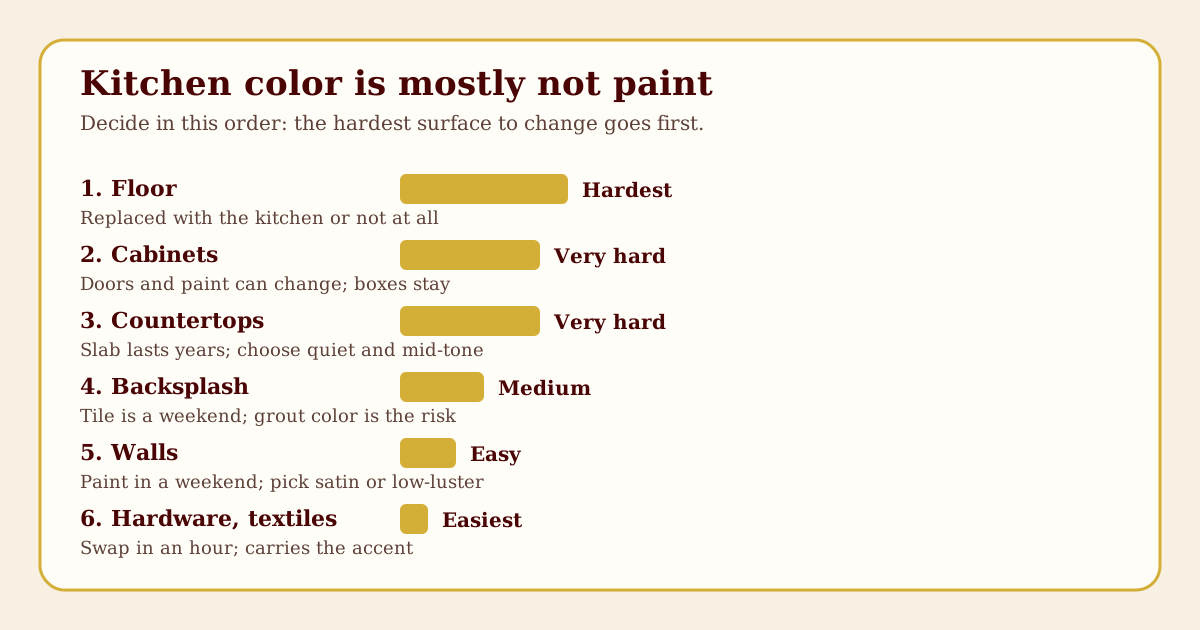
Count the area of each surface in a kitchen and the paint chip comes last. Picture a kitchen with 30 linear feet of cabinet fronts, a slab counter, a tile floor and a tile backsplash: it has chosen most of its color before anyone opens a paint can. So the sections below run from the surface that is hardest to change to the easiest, because each one binds the choices after it. Every surface gets the tradition's reading, the practical facts, and a short rule to take into a showroom.
Whole-home palettes live in the feng shui colors by room guide; this page stays in the kitchen. Where the stove, sink and refrigerator go belongs to the kitchen layout guide and the stove and sink placement guide. Here the layout is assumed settled and the only question is color and finish.
Fire, Water and a go-between: the tradition's kitchen palette
Feng shui borrows its color vocabulary from the Chinese five phases, or wuxing: wood, fire, earth, metal and water. The Internet Encyclopedia of Philosophy's article on Wuxing sets out the two sequences that matter for design. In the generating cycle, "wood produced fire, fire produced earth, earth produced metal, metal produced water, and water produced wood." In the overcoming cycle, wood conquers earth, metal conquers wood, fire conquers metal, water conquers fire and earth conquers water. The same article notes that early Chinese texts list five colors, green, yellow, black, red and white, and links wood with blue-green.
Modern feng shui writing turns that into a room palette. The version used across this site, in the five elements balancing guide, runs:
| Element | Common color and material cues | Where it shows up in a kitchen |
|---|---|---|
| Wood | Green, teal, timber, plants, wicker | Wood cabinets, a timber board, herbs, a green backsplash |
| Fire | Red, orange, strong pink, purple, warm bright light | The stove itself, red accents, warm lamps |
| Earth | Beige, sand, terracotta, yellow, clay, stone | Stone or ceramic counters, tile, warm neutral walls |
| Metal | White, grey, brass, steel, round shapes | White cabinets, steel appliances, brass hardware |
| Water | Blue, black, glass, mirrored or wavy surfaces | The sink, the refrigerator, a black counter, glass tile |
The kitchen is unusual because its function already supplies two opposing elements. Practitioners commonly read the stove as Fire and the sink and refrigerator as Water, and the overcoming cycle says water conquers fire. The traditional response is not to remove either appliance. It is to place a mediator between them. Because water nourishes wood and wood feeds fire, wood is the usual go-between: a timber board, a wooden shelf, a green plant or a herb pot, and green or timber-toned surfaces nearby. The second common mediator is earth, which in the overcoming cycle dams water and in the generating cycle is what fire produces, so earth tones are said to settle a kitchen that feels too sharp. Our colors-by-room page takes the same line: warm neutrals, herb greens and timber, with red kept out of the large surfaces.
These are cultural design lenses. They do not predict money, health or relationships, and no color replaces a working hood, safe clearances or a clean room. What they give you is a coherent starting palette: green and timber tones, warm neutrals, a limited amount of red, and a deliberate decision about white and black.
Where schools differ
Three points are argued, and it is better to know that than to hear one verdict as settled.
- Form school and BTB (Black Sect) writing tends to work from the kitchen's actual use and from the five-element palette above, often as an optional visual layer. Under this approach color is mainly about balance and mood.
- Compass school and Eight Mansions writing may read the kitchen's compass sector and recommend adding or reducing an element for that sector, so a kitchen in a Wood sector and a kitchen in a Metal sector would get different advice for the same stove. If you follow that method, the sector rule overrides the generic palette here. Our Bagua map guide shows how to find a sector.
- Folk custom adds its own rules, such as red for festivals and luck in Chinese culture. Those are cultural symbols with a long history, discussed in red in Chinese culture, and they do not all point the same way as the element charts.
The order to decide: from locked in to easy to change
A remodeler thinks in layers, and so should a color plan. This ranking is our own, based on how each surface is installed. Treat it as a planning aid, not an industry standard.
| Rank | Surface | How hard to change | Why |
|---|---|---|---|
| 1 (hardest) | Floor | Very hard | Runs under the cabinets, tied to subfloor, threshold heights and appliances |
| 2 | Cabinet boxes | Very hard | The most expensive single item; replacing boxes means replacing the room |
| 3 | Countertops | Very hard | Templated to the cabinets, glued and often plumbed in |
| 4 | Backsplash | Medium | Tile can be redone in a weekend, but demolition touches the wall |
| 5 | Cabinet doors and paint | Medium | Doors and finishes can be replaced or repainted without moving boxes |
| 6 | Wall paint | Easy | A weekend and a few tools |
| 7 (easiest) | Hardware, lamp shades, textiles, small objects | Easiest | An hour, and they can move with you |
The practical consequence is a rule: pick the colors of ranks 1 to 3 as a quiet, mid-tone, long-lived base, put the strongest statement in ranks 5 to 7, and treat wall paint as the last piece that ties it together. If a surface is already fixed, such as a rental's white laminate, you do not choose it; you design around it.
Floor
Tradition. Many practitioners treat the floor as the "ground" of the room and favor Earth or Wood tones: timber, terracotta, warm stone, or a mid-tone tile. A very dark floor can read as heavy Water to some, and a bright white floor as sharp Metal. Neither is a rule, just a reading of the five-phase palette.
Practical. Pick the floor for how it handles water, grease and dropped pans before you pick it for color. Mid-tones in a matte or lightly textured finish hide crumbs, water spots and scratches better than pure black or pure white, which show every flaw. Keep floor and lower cabinet color from being the same; if both are dark, the base of the room disappears and the room reads as a single block.
Advertisement
Cabinets
Tradition. Cabinet color is where kitchens carry most of their element. Timber cabinets are Wood, green cabinets are Wood, cream, sand and warm grey cabinets lean Earth, white cabinets are Metal, navy or black cabinets are Water, and red cabinets are Fire. Practitioners who follow the mediator idea often choose timber or green for the largest area, because Wood sits between Water and Fire.
Practical. Cabinets are the largest vertical surface and the one you touch most. Look at three things before the color.
- The finish. A durable, cleanable factory or professionally applied finish matters more than the shade. Ask what the finish is, how it behaves with grease and steam, and whether doors can be refinished later.
- Sheen. A very glossy door shows fingerprints and light glare; a very flat one shows wear. A low sheen in between is usually the safe choice.
- Light colors versus dark. A light cabinet reflects more of the room's light, which helps a small kitchen. A dark cabinet absorbs it. The Benjamin Moore course material on LRV states that darker colors absorb more light, so they may need more artificial lighting.
Rule for the showroom. Ask for a full door, not a chip, and hold it against the countertop sample under the same light, because cabinet and counter will always be seen together.
The red, black and white question
This is where search results disagree most, so here is the plain version.
- Red cabinets or walls. The stove already provides Fire, and many practitioners prefer not to add more across a large area. They keep red to accents: a kettle, a bowl, a cloth, a lamp shade. Other practitioners, especially those working from Chinese festive custom, are comfortable with red in a kitchen. Practical warning: saturated red hides nothing and fades, so it is a surface for textiles, not for a wall that gets steam.
- Black cabinets or counters. Black is Water in the usual palette. Some practitioners warn about a lot of black near the stove because water conquers fire; others treat black as a grounding dark neutral and use it in counters, hardware or one wall. Practical warning: black shows dust, water marks and fingerprints more than mid-tones do, and it needs bright task lighting.
- All-white kitchens. White is Metal. Some practitioners say fire weakens metal and suggest adding timber, a green, or a warm earth tone so the room is not sterile. Others read an all-white room as clean and calm. Practical warning: very white rooms can feel cold, and a cool white next to warm timber can look dirty.
None of these is a prohibition. The tradition as it appears in this site's other guides gives proportions, not bans, and it says the same about red in a room that is not Fire. The decision rule that works in either school is the same: choose the dominant color from Wood or Earth if you want the traditional balance, then bring in the other colors in measured doses.
Countertops
Tradition. Stone, ceramic and clay are Earth, timber butcher block is Wood, steel is Metal, and glass is Water. A counter that is warm in tone and honest about its material is the classic Earth answer to the Fire and Water pair. A mirror-bright black counter reads as Water to some practitioners and as a sleek neutral to others.
Practical. This is the surface where function wins over symbolism, because it is where you cut, hot-set and spill.
- Tone. Mid-tones with a little pattern hide crumbs and small stains. Pure white shows coffee and turmeric. Pure black shows dust, fingerprints and water rings more than most people expect, so it asks for more cleaning in daylight.
- Light. A very dark counter absorbs light, so it needs good task lighting. NKBA Guideline 31 recommends that every work surface be well illuminated by appropriate task lighting. A US Department of Energy gateway brief on undercabinet lighting says the primary job of undercabinet light is to illuminate the work surface immediately beneath. A Lighting Research Center pattern book on kitchens adds placement advice aimed at keeping glare and the cook's own shadow off the work area.
- Reflective finishes. A highly polished counter can bounce glare from the window or the lamp into the cook's eyes. View a sample in real light, not under shop lighting.
Rule for the showroom. Ask for a large slab sample, take it home, and lay it under the undercabinet light and in daylight. Wet it. Smear a little oil on it. Look at it the next morning.
Backsplash and grout
Tradition. The backsplash is the wall behind the stove and sink, the place where Fire and Water meet. Green, timber-look or earth-toned tile is the usual mediator suggested; glass tile is read as Water and metal tile as Metal. Practitioners who watch the stove-to-sink relationship often put their mediator color here.
Practical. A backsplash is a cleaning surface. Look at three things:
- Grout color. Light grout stains from oil and tomato and needs sealing and cleaning; dark grout hides stains but shows white mineral deposits. Mid-grey or a grout close to the tile color is the easiest compromise.
- Joints. Large tiles mean fewer grout lines and less to scrub.
- Behind the stove. If the cooktop is gas, keep combustible items off the backsplash and use a hood that vents outdoors, as the EPA advises. Run it while you cook, and use the back burners when you can, as the EPA suggests.
Walls: the last and cheapest decision
By now most of the room has a color. The wall color is the one that connects them.
Tradition. For the kitchen, the site's colors-by-room guide recommends warm neutrals, herb greens and timber, and keeps red out of the large surfaces. That fits the mediator idea: Earth or Wood on the wall, with the stove as the only large block of Fire.
Practical: sheen and washability. Kitchen walls get steam, grease and splashes, so the finish matters. The Sherwin-Williams sheen guide describes satin finishes as "easily washable" and suited to areas prone to nicks and scuffs, low-luster as "both durable and easy to clean," and flat as "prone to scuffs and stains." It also says matte is "great for hiding surface imperfections." The trade-off is clear: flatter sheens hide wall flaws but mark more easily; glossier sheens wipe clean but show bumps and roller marks. A satin or low-luster finish is the usual compromise for kitchen walls. Before buying, read the can or the technical data sheet for the maker's scrub rating and recoat time, and do not assume that a sheen name means the same thing across brands.
Practical: LRV. Light reflectance value is a number from 0 to 100 printed on most paint fan decks and on maker websites. The Benjamin Moore course material describes 0 as absolute black and 100 as perfectly reflective white, with the deepest black around 5 and a very reflective white around 90. The same source gives ASHRAE minimums of 80 for ceilings, 50 for walls and 20 for floors as reference values for lit commercial spaces. That is a commercial reference, not a kitchen rule, but it is a useful check: a wall color with an LRV well under 50 will absorb a good share of your light.
How to use LRV in a kitchen.
- If the room has little daylight, choose a wall color with a higher LRV or add light.
- If the room is already bright, a lower LRV color can look rich rather than dim.
- Compare LRV across your cabinet, counter and wall samples; if all three are low, the room needs more fixtures.
- NKBA Guideline 31's code figure is that window or skylight area should be at least 8% of the kitchen's floor area. For a 120 square foot kitchen that is 120 x 0.08 = 9.6 square feet of window. If you have less, treat the room as light-starved and pick lighter colors.
Rule for the showroom. Paint a large sample board, not a small patch. Look at it at the hour you cook, with the lights on.
Advertisement
Appliances, hardware and the small layer
This is the cheapest and fastest layer, which makes it the best place to experiment. Tradition reads stainless steel and brass as Metal, timber handles as Wood and black matte hardware as Water. If you want the Wood mediator without changing cabinets, use timber knobs, a wooden board and a row of herbs on the sill. If you want a touch of Fire without painting, use a red kettle or a terracotta pot.
Appliance finish is locked in too, since a range or refrigerator is expensive to replace, and a working outdoor-venting hood matters more than any color. Bulb color temperature changes how every surface above looks; the feng shui lighting guide covers it.
Decision table by surface
Use this to turn the tradition and the practical facts into a short list. "Tradition-leaning" means the choice most feng shui writers would favor for the Fire and Water pair; "practical check" is what to confirm before paying.
| Surface | Tradition-leaning choice | Debated choice | Practical check | Change later? |
|---|---|---|---|---|
| Floor | Mid-tone timber, terracotta or warm stone | Very dark or very white | Water and grease resistance; mid-tone hides crumbs | Hard |
| Cabinets | Timber, herb green, warm cream or sand | Red, black, all white | Cleanable finish, low sheen, full door sample | Doors and paint, medium; boxes, hard |
| Counters | Warm stone or ceramic, butcher block | Black, polished mirror finishes | Task light, seams, stains, glare | Hard |
| Backsplash | Green, timber-look or earth-toned tile | Black glass, bright red | Grout color, large format tile, cleaning | Medium |
| Walls | Warm neutral or herb green | Strong red, charcoal | Satin or low-luster, LRV above 50 where light is short | Easy |
| Hardware, textiles | Timber, brass, small red or green accents | Black matte (Water) | Swap-ability, lease rules | Easiest |
Three worked kitchens
Each case starts from the constraint a remodeler would name first. The kitchens are made up to show the method; they are not real properties.
Case A: a white rental galley you cannot paint
Inputs. The lease forbids painting. The cabinets are white laminate, the counter is a white and grey laminate, the floor is pale grey vinyl, and the walls are white. The galley is 9 feet wide between walls, with 24-inch deep counter runs on both sides. The aisle is 108 inches minus 48 inches, which leaves 60 inches. That clears the NKBA recommended 42 inches for one cook, so there is room to add things without crowding.
What the tradition suggests. An all-white room is Metal-dominant, and many practitioners suggest adding Wood or Earth to avoid a cold kitchen.
What to do.
- Add Wood without touching the surfaces: a timber cutting board between the sink and the stove, a wooden spice rack, a row of herb pots if there is a window.
- Add Earth with textiles: a warm sand or terracotta runner on the floor if it will not slip or block the work aisle, and a clay bowl for fruit.
- Change the light, not the paint: a warm white bulb in a movable lamp or removable undercabinet strip makes the white surfaces look less stark and makes the work counter easier to see. This is reversible and comes with you.
- Keep Fire small: one red or orange object, such as a kettle or a pot, rather than painting anything red.
Result. The room keeps its neutral shell and gains a mediator between the sink and the stove. The cost is a few objects. For more on this approach see the renters whole-home guide.
Case B: a new build where you choose cabinets
Inputs. A new kitchen, 120 square feet, one window of 12 square feet. That is 12 / 120 = 10% of floor area, above the NKBA code 8% figure. The builder offers white, grey, timber and navy cabinets. The stove is on one wall and the sink under the window.
What the tradition suggests. Navy is Water and the sink is already Water, so a lot of navy doubles it. White is Metal. Timber is Wood and sits between the pair.
What to do.
- Choose timber or a warm grey-green for the lower cabinets, the biggest block next to the stove and sink.
- Choose a lighter upper cabinet or open shelf color to keep the room bright.
- Pick a mid-tone counter with a little pattern rather than pure white or black, and test it under the planned undercabinet light.
- Choose a backsplash that sits between the cabinet and counter tones, with grout close to the tile color.
- Choose wall paint last: a warm neutral in satin or low-luster, with an LRV that suits the daylight you have.
- Ask for a ducted hood of at least 150 cfm, per the NKBA recommendation.
Result. The palette is mostly Wood and Earth with Metal in appliances, the stove is the only large Fire, and the sink is the only large Water. Because the hardest surfaces are mid-tone and warm, the room can take a bolder wall color later.
Case C: a dated oak kitchen on a paint-only budget
Inputs. Honey-oak cabinets, beige laminate counters, white tile backsplash, vinyl floor in a tan pattern, walls in yellowed white. The budget is paint and small items only. No new counters, no new cabinets.
What the tradition suggests. Oak is Wood, beige is Earth: the base is already traditional. The room feels dated because the warm yellow of the oak competes with the yellowed walls.
What to do.
- Choose a wall color from the tone of the counters, not the oak. A soft neutral or herb green with a satin or low-luster finish lets the oak look intentional.
- Paint the cabinet boxes only if the finish is sound and you can prepare and seal them properly; otherwise keep the oak and change hardware.
- Replace dated hardware with a matte metal or timber style.
- Swap the bulbs for a consistent warm white and add undercabinet light if there is none.
- Keep the colors in the wall paint to a single hue so the cabinets, counters and floor read as a coherent set.
Result. The room keeps its Wood and Earth base, loses its yellow cast, and has a new, cleaner finish. The cost is paint, hardware and bulbs.
Advertisement
Where the order bends, and the mistakes that cost most
The locked-in-first order holds in most kitchens. Four situations change how it applies.
- Open-plan kitchens are seen from the sofa as much as from the stove, so cabinet and wall colors also have to sit with the living area. Keep sheen and the mediator color consistent across the open space; the living room layout guide covers the other side of the room.
- Small kitchens gain most from lighter cabinets and walls, with contrast kept to hardware and textiles. Here a higher-LRV wall does real work.
- Children and pets call for scrubbable finishes and mid-tones that forgive handprints and paw marks, on lower cabinets above all.
- Selling soon shifts the goal to a clean neutral that photographs and lights well, as the selling a house guide explains.
Three mistakes undo the order. Choosing paint first, then forcing a counter to match it, gets the sequence backwards. Judging any surface from a chip under shop lights tells you little; use large samples in your own light. And letting symbolism override safety never works: a weak hood, a hot-pan route across traffic or a blocked exit cannot be fixed with a color.
Showroom checklist: what to bring home before you pay
| Surface | Bring home | Test it this way |
|---|---|---|
| Floor | A loose tile or plank | Lay it beside the counter and cabinet samples; drop water and crumbs on it |
| Cabinets | A full door, not a chip | Hold it against the counter sample under the planned task light; ask what the finish is and whether it can be refinished |
| Countertop | A large slab sample | Wet it, smear a little oil on it, and look again the next morning and under undercabinet light |
| Backsplash | Two tiles and a grout sample | Set them with the grout color you plan and view them from where you stand to cook |
| Walls | A painted sample board | Look at it at the hour you cook, lights on; read sheen, scrub rating, recoat time and LRV on the maker's data sheet |
| Hood | The spec sheet | Confirm it vents outdoors and meets the NKBA recommendation of at least 150 cfm |
No brand is recommended here, and no price is given because prices vary by region and time.
Once the colors are settled, the next question is usually where the stove, sink and refrigerator should sit. The stove and sink placement guide takes the Fire and Water pairing used above and tests it against clearances and safety.
Sources
- NKBA Kitchen Planning Guidelines (PDF): work aisle width (Guideline 6), ventilation and hood sizing (Guideline 19), lighting and daylight code figure (Guideline 31). Checked November 2026.
- Sherwin-Williams, How to Choose a Paint Finish: what each sheen is and how washable it is described to be. Checked November 2026.
- Benjamin Moore course material via BNP Media, The Science of Visible Light and Its Impact on Paint Specification: definition and scale of light reflectance value, darker colors and artificial light, ASHRAE reference minimums. Checked November 2026.
- US EPA, Strategies for Improving Indoor Air Quality While Cooking: running an outdoor-venting hood, back burners, cleaning the filter. Checked November 2026.
- US Department of Energy, Undercabinet Lighting gateway brief (PDF): the work-surface task-lighting purpose of undercabinet light. Checked November 2026.
- Lighting Research Center, Lighting Patterns for Homes: Kitchens (PDF): luminaire placement and glare control at work surfaces. Checked November 2026.
- Internet Encyclopedia of Philosophy, Wuxing (Wu-hsing): the generating and overcoming cycles and the five colors in early texts. Checked November 2026.
Editorial note: Feng shui is a cultural and design tradition, and its color and element associations vary by school. This article is educational, does not predict money, health, relationships or any other outcome, and does not replace building codes, a lease, manufacturer instructions or advice from a licensed contractor, electrician or designer. Check paint, finish and ventilation requirements with the maker and your local authority.