Short answer
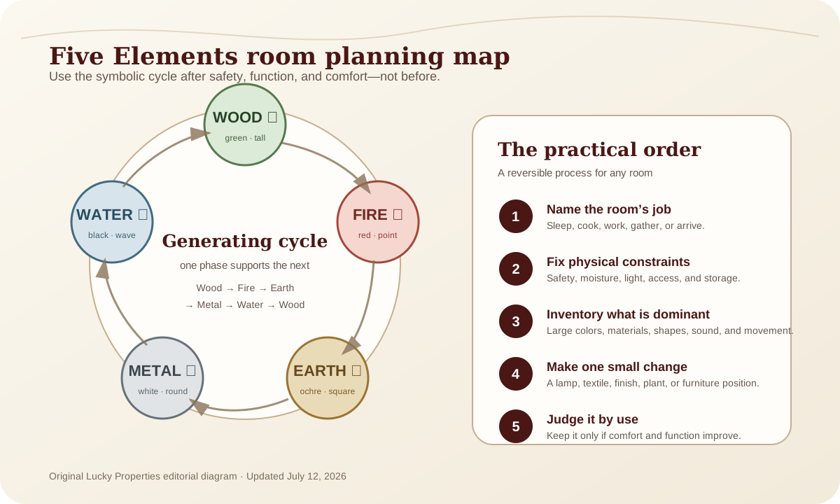
Feng Shui colours are most useful as a design vocabulary, not a list of lucky paint codes. Start with the room’s daylight, evening lighting, function, existing flooring, and the mood you need from the space. Then use Five Elements associations—Wood, Fire, Earth, Metal, Water—to choose a direction such as warmer, quieter, lighter, or more grounded. Test real samples on the wall before committing; the same colour can change dramatically between morning and night.
Colour advice fails when it ignores light
“Use green in the east” or “paint the south wall red” sounds decisive, but it does not tell a renter with a dark north-facing room what will happen to a saturated green after sunset. It does not tell a homeowner whether a glossy red wall will reflect into a television, or whether the existing beige tile makes a white paint look yellow.
The same pigment is perceived through surrounding colours, daylight, bulb temperature, sheen, and texture. That is not a Feng Shui disagreement; it is ordinary visual perception. Use symbolism after you understand the room that will carry it.
Start with function and exposure
Write one plain sentence for the room: “This is where we wake slowly,” “this is where we host friends,” or “this is where I need to concentrate for two hours.” Then observe the light at three times: morning, late afternoon, and evening with the lamps you actually use.
| Room need | Design question | A restrained Five Elements cue |
|---|---|---|
| Rest | Does the room have glare, screen reflection, or too many competing colours? | Water-like depth or Earth-like softness through textiles, not necessarily blue walls |
| Conversation | Does seating feel cool, flat, or disconnected? | Wood through grain and green accents; Fire through warm light or one small warm note |
| Focus | Is the desk gloomy, harsh, or visually chaotic? | Wood through a plant/material; Metal through clear, simple task tools |
| Arrival | Is the entry hard to navigate or too dim? | Earth through a grounded mat or warm neutral; Fire through safe, practical lighting |
| Dining | Does the room feel unfinished at night? | Warm light and a balanced material mix before strong paint |
These are optional associations, not diagnoses. A red wall does not produce confidence, and a blue wall does not treat stress. The design value is that the associations give you a reason to ask what is missing rather than buying random accessories.
Advertisement
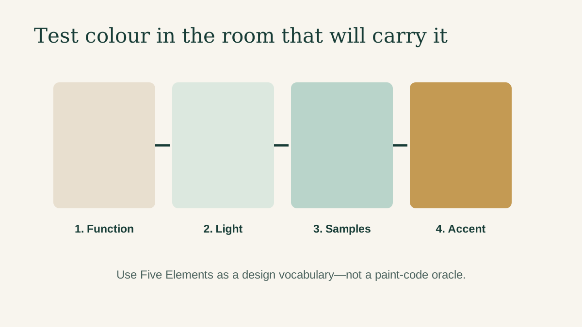
The four-sample method
Buy or borrow four samples in the same family: one a little warmer, one cooler, one lighter, and one deeper. Paint them on removable boards or approved test areas. Place one near the window and one on an interior wall. Observe for several days.
- Look in daylight with other lights off.
- Look at the time you normally use the room.
- Put the main textile or wood sample beside the paint.
- Check the colour from the doorway and from the primary seat or bed.
- Ask whether it makes a real problem better: glare, gloom, visual noise, or an abrupt transition.
The U.S. Department of Energy’s lighting guidance is useful background when you are also changing bulbs. A paint decision and a lighting decision should be tested together, because the evening bulb may matter more than the wall colour.
Translate the Five Elements without literalism
Wood: growth, verticality, and living texture
Wood associations often point toward greens, plant forms, timber grain, and upright shapes. In a compact room, use one wood cue rather than a forest of plants. A healthy plant, wood-framed artwork, or oak-toned shelf may be enough. Make sure the plant fits the light and the shelf does not reduce the route through the room.
Fire: warmth, visibility, and emphasis
Fire is often connected to reds, orange, strong light, and active expression. Use it sparingly in rooms that already run hot, glare-prone, or visually busy. A warm lamp, rust cushion, or artwork can supply emphasis without a wall that feels exhausting after dark.
Earth: grounding and quiet warmth
Earth cues include clay, sand, warm neutrals, stone, and square or low stable forms. They work well when a room feels scattered, but too much beige can make a low-light room look muddy. Test undertones next to flooring and cabinetry; “neutral” is not a single colour.
Metal: clarity, reflection, and simplicity
Metal associations include white, grey, metallic surfaces, and clean shapes. Use them to lighten a dense room or make a desk feel more ordered. In a cold, echoing space, balance hard reflective surfaces with textile, wood, or softer light rather than adding more white paint.
Water: depth, flow, and darker quiet tones
Water associations include black, charcoal, blue, glass, and reflective surfaces. A deep colour can create restfulness or make a small room feel compressed, depending on light. Use it as a lower cabinet, textile, or one wall after testing—not as a blanket prescription for a bedroom.
For a fuller elemental framework, read the Five Elements balancing guide. Keep it subordinate to the room’s real use and conditions.
Materials matter as much as paint
Paint is not the only colour field. Floors, blinds, sofas, kitchen cabinets, large screens, and daylight often cover more area. Before painting, list the surfaces you cannot or do not want to change. A room with cool grey tile and warm wood cabinets may need a bridging neutral, not another strong elemental colour.
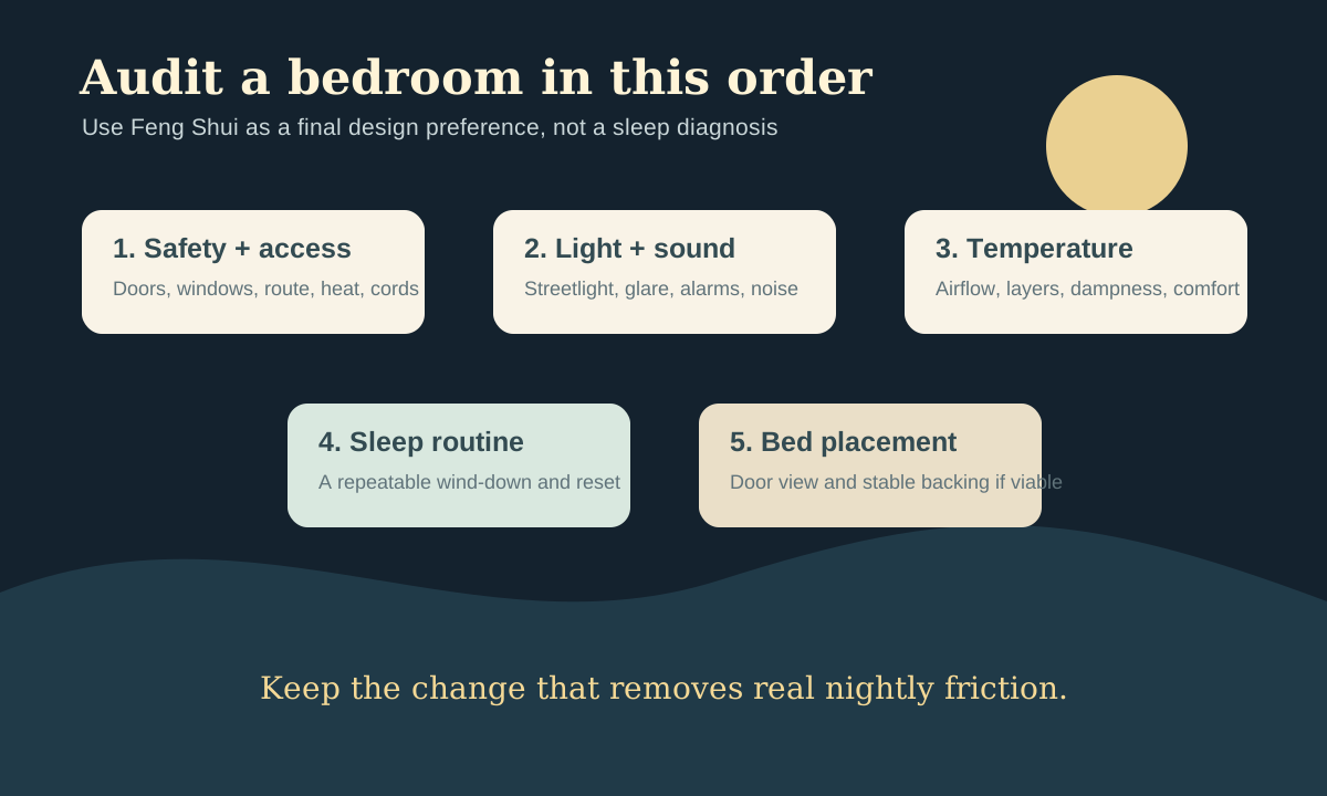
In rentals, work from the removable layer: lamp shades, bedding, art, a throw, a rug, table linens, or storage boxes. These let you test a direction without hiding damage, blocking vents, or spending on a paint reversal. In a bedroom, start with comfort and darkness; see the sleep-environment audit for the physical conditions that colour alone cannot fix.
A worked example: the dim living room
Suppose a living room has one north-facing window, dark flooring, a grey sofa, and cool overhead LEDs. A generic Feng Shui rule may prescribe a colour for a compass sector. The more useful sequence is: first try warmer bulbs appropriate for the fixture, add a lamp near the seating area, and test a warm neutral against the floor. If the room still feels flat, introduce a small Wood cue through a plant or wood table and a Fire cue through a warm textile. The result is intentional without claiming that the paint changes prosperity.
Sources and what to read next
- U.S. Department of Energy lighting choices explains the practical lighting variables that change how a painted room is seen.
- Five Elements balancing guide provides the cultural framework behind the colour associations used here.
- Living-room layout plan helps when the visual problem is really an arrangement or route problem.
What to read next: If colour will not settle a room that feels crowded, use the living-room layout plan next. A quieter wall cannot repair a sofa that blocks the only path through the room.